Next step was to now produce our ancillary tasks, we started with our digi back, album cover, back cover and inside pages. We initially began by looking at these albums in class;

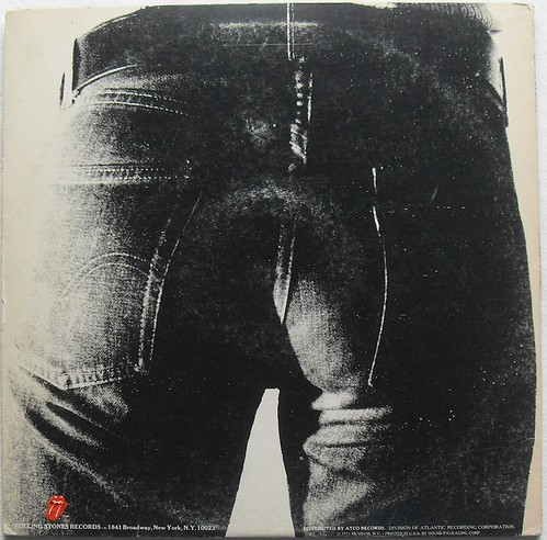
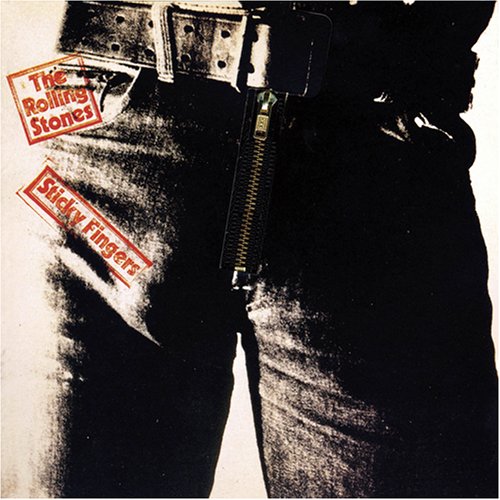
We specifically looked out how the Rolling Stones Sticky Fingers album was very significant as a promotional pac. Specifically as this album signified a new cutting edge, 'sex, drugs and rock n roll' look to their band and music. Points of interest were particularly the album art, which was by Andy Warhol, and how his famous pop art style is clearly shown in the album with high contrast - done specifically to emphaise the 'buldge' of where the models penis should be. Heightening the products sex appeal. Also when looking at the back image of the album, thoughts of fluidity between imagery of the front and back sprung to mind. Especially how i may want to incorporate this into our own digi pac.
I began our research of digi pacs, by looking through albums i had at home and what elements they were made up of. Here is some images of us looking through the albums digi pac, to establish what was needed in our very own digi pac:
Also by looking at album covers of similar artists for example; all time low and boys like girls.
Conclusions after looking at digi pacs:
- Whether we should have a photographic or cartoon like image
- Whether we should use take inspiration of images from the video to provide links between both
- We should have the lyrics of the song on the inside pages
- Also we should include exclusive imagery of the band on the inside pages.


No comments:
Post a Comment