Thursday, 17 February 2011

Digital Pac and Magazine Advert Questionaire

Below is our questionnaire which we carried out in order to find out our audiences opinion on our possible digi pac and magazine advert choices. We thought this would help in clarifying decisions, and considering things that may have been left out before.


Question 1: Do you expect a pop-rock/alternative bands magazine advert to be black & white OR colour?

The purpose of this question was to identify the colours that should be used when advertising and also to see whether it should match with Lost In Colour’s, ‘Searching For The Sun In The Dark’s’ music video and incorporating intertextual references. I found that that 2/3 of the public expected a pop-rock bands magazine to be in black and white, likely to be due to the stereotypical representation of this genre. However, 8 people of the 25 members of the public I asked chose ‘colour.’ This suggests to me that I must look into more detail regarding secondary research to identify what colours I should use during promotion. It also suggests to me that perhaps the majority of the advert should be black and white, with a hint of colour. Much like what is seen in the music video, this would considerably make a positive link between the two cross media forms incorporating a form of vertical intertextuality.  


Question 2: Do you expect a pop-rock/alternative bands magazine advert to be animated or photographic?
This was a significantly important question to ask; therefore it was necessary for me to ensure the public really thought about their answer. The overall reaction I got was that 2/3rds of the public felt that photographic pictures are more likely to be expected. This, therefore tells me that in order to appeal to the audience I should incorporate photographic aspects even though there is the suggestion from secondary research that this is not the common thing. Lost In Colour will be taking an original and unique approach to their new, first promotional campaign.


Question 3: What do you expect to see on a new albums magazine advert? (Tick all that apply)

The options that the public I asked had were: the album, pictures, pictures of the band, lyrics and information. Immediately I was made aware that all 25 members of the public expected to find information on the magazine advert, therefore I will definitely be including this. However, during my secondary research I will also look at the information they included to see what Lost In Colour’s album advert should have on. 0 out of 25 of the public felt that lyrics should NOT be include, therefore I will obviously not include this. Although 7 members of the public selected that they expected to see pictures of the band on the magazine advert I am not going to include this due to the majority of the public (16 out of 25) saying that they would just expect to see random pictures, a feature which I expect to find during secondary research. Just below half of the public also said that they expected to see the album on the magazine advert, therefore this suggests to me that I should perhaps use the same images for the front cover of the digi-pack and the magazine advert.

Question 4: What typography would you expect to see associate with a pop-rock/alternative band magazine?

From asking this question I found that I did not get a clear answer, therefore finding out what sort of typography should be used during secondary research is a very important aspect. I will find the answer to this question through looking at similar genre bands to Lost In Colour in music magazines intended for promoting bands new albums.


Question 5: What is more effective a single page spread or a double page spread for a magazine advert?

This was an important question to ask as it would be 50 % of the overall decision of what the size of the magazine advert would be. I found that 17 out of 25 people thought that the most effective size would be a single page spread. Therefore, I will only be covering one size of a magazine, however as of yet it is uncertain what ratio of the one page spread will take up. This will depend on secondary research and what Rachel and I will find in other music magazines.


Question 6: What appeals most to you when looking at a magazine advert for a new album?

For this question I gave the option answers of: colour, picture, title and information. I found that just over half of the public I asked said that a picture would appeal most when they looked at a magazine advert for a new album. A few also said that the colour appeals to them most and stands out catching their eye. The options; title and information were only chosen by a couple of the public suggesting that they should be included, however are not to be used as the immediate thing to draw potential customer's attention.


Question 7: Do you expect a pop-rock/alternative bands digi-pack to be black & white OR colour?

The answer to this was very mixed and almost half chose each option. This suggests that the public are unsure with which would be the correct answer, although there isn’t one. This tells me that there is so much variety in the current music market that each individual singer or band try and take an original approach to a promotional campaign. Always expect the unexpected. Therefore I will look into this in more detail during secondary research.


Question 8: Do you expect a pop-rock/alternative bands digi-pack to be animated or photographic?

Much like the magazine advert in question 5 I found a similar answer. 8 people expected to see an animated pack, whereas the remainder thought that a photographic digi-pack would be more common. This, therefore tells me that in order to appeal to the audience I should incorporate photographic aspects even though there is the suggestion from secondary research that this is not the common thing. Lost In Colour will be taking an original and unique approach to their new, first promotional campaign.


Question 9: What is more effective a CD size digi-pack or a DVD size digi-pack?

Quite simply, the majority of the people I asked (22) said that they think a CD size digi-pack would be more effective in the case of an album. The reason being that this size is more convenient and also that you do not have to pay excessive amounts for the packaging.


Question 10: What do you expect to see inside a digi-pack? (Tick all that apply)

Straight away by looking at the answers to this question I can tell that the very popular choices of answer are: pictures of the band, lyrics and information about the band/ band members. Therefore, we will most definitely incorporate these aspects in Lost In Colours digi-pack, front, back and middle. The likely reason for these being chosen is due to these being the common aspects that consumers find alongside an album they have purchased. 9 people also chose that they expected to see pictures in the digi-pack, however this can correlate with pictures of the band.


Question 11: What typography would you expect to see associated with a pop-rock/alternative band digi-pack?
Much like question 7 I found that asking this question I did not get a clear answer, therefore finding out what sort of typography should be used during secondary research is a very important aspect. I will find the answer to this question through looking at similar genre bands to Lost In Colour in music magazines intended for promoting bands new albums.


Question 12: What magazine would you expect to find a pop-rock/alternative bands album advertised in?

This was possibly the most important question to ask in reference to advertising the album in a magazine. The was also the worry that the public would not know of the music magazines I had given them as an option, therefore I showed them a picture of the magazines to let them know. I found that the most popular of answers was the NME magazine, a very popular magazine for larger bands. However, there is the possibility that this maybe too financially expensive for the institution that Lost In Colour are signed to. Nobody chose Rock Sound, most likely due to its unpopularity with the general public, instead "rock" fans. Whereas a few people each chose the magazines: The Fly, which is slightly less common but know in schools and colleges with teenagers. Rolling Stones, which is intended for a slightly older audience and older bands and Q magazine which is slightly less well know. Therefore, it is likely that Lost In Colours new album will be promoted and advertised in NME for a considerable financial investment.

Initial Digi Pac ideas

I started the initial digi pac idea by investigating into  both cartoon like and photographic digi pac outcomes. I started by looking for stills in our video that would inspire composition for the album cover. I feel taking elements from the music video into the album cover is very effective as it provided direct links between the two, so the products flow and work together as a promotional pac. I was particularly inspired by these images in the video:


This image gave me ideas of  using the stereotypes on the front cover, to show sipets of each narrative on the album cover, to show the content of the video on the digi pac. I also decided to experiment with this in a cartoon like method, to see how successfully it would be.


Above is a very rough sketch of how i would compose the stereotype idea. Displaying the signs and the text - which would help connote the feelings also conveyed in the video as well as on the digi pac. However i think that this composition may be too busy as an album cover, and will not appeal to the audience enough by instead suggesting and relating to much to the video instead of securing sales of fans.

The other still that inspired my initial ideas was the below:


I then experimented this composition into a cartoon rough draft of an album cover:


Although i felt this would be effective as a cartoon album cover, i felt the photographic image would be more successful in enticing viewers as i think having a quirky and odd image like this as a photograph would be more cutting edge, as photographs reflect reality. Whereas with this image as a cartoon, would suggest reality less and therefore would not enhance the harshness and cutting edge effect of the image and the connoted meaning.

Therefore i pursued more experimentation into the effectiveness of this composition as a photographic image:


I found this above image much more striking as an album cover, as i found the photographic ness, gave it the sense of reality, and also related directly the music video. Also the faded colouring also added to the reality and harshness of the image. I also started to investigate into text, font and positioning. For this initial idea i was influenced by arctic monkeys humbug albums font:


This being as i liked the way the font was alot smaller than the image, which meant that image over took and did most of the appealing. This i thought would work very well combined with the above striking image i want to use. I also took note of the way the text was positioned on the palest part of the image in the humbug album, for example the white jumper. This meant all the text is in a small font, it still stands out by the harsh contrast of the black text on white. This i also tried to incorporate in my text positioning above, as i specifically choose the white wall background of the image, so the text would stand out.

Wednesday, 16 February 2011

DIgital pac Research. Cartoon vs photographic

We started to think about our potential album cover images and representations to use from some of the still shots in the footage. We the started to think about the conventions used in the rock pop/alternative genre when promoting their album cover, and how the target audience sees it and relates to it. We did this by looking at album covers of similar bands of the same genre.


Above are the album covers of band  that are of the rock pop genre and similar to the sound of lost in colour's music. The primary use of cartoons and artwork on their album covers is what we discovered from looking at this.
However from doing more research of how the band wish to be portrayed we looked on myspace, here we found that the genre lost in colour have come under is in fact alternative:

Therefore looking into album artwork of alternative bands we found that they were instead predominantly photographic.

For example the albums of alternative bands such as the arctic monkeys, the killers


Above are all alternative artists album covers. All of which incorporated the use of photographic imagery. Which if we decide that Lost in colour's genre fits more to the alternative genre it would be much better suited to use photographic imagery instead of cartoon like artwork. Also another common feature we found in common with  all the alternative album covers is that they all used photographic imagery but in an odd, slightly weird and cutting edge style. For example the Kasabian album cover does this through the use of mise en scene, so it looks like the band members are in a different time period on first glance, similarly red hot chili peppers uses a random collections of photographic props. Further arctic monkeys album covers use a variety of props such as cigarettes to make them cutting edge and a variety of unconventional composition to make the album appear cutting edge.

Therefore also we would have to incorporate slightly odd and unconventional imagery into our album images to make it similar to artists of the same genre. Additionally i think the use of slightly weird photographic images may be specifically used for alternative albums, as alternative fans tend to be different in the way they dress and behave, they like to stand out, wear and do things that are unconventional - especially in the younger generations. Therefore i conclude that cutting edge, different and slightly weird imagery would therefore appeal to this type of audience. If we decided that lost in colour do fit the alternative music genre, we will also have to consider how our slightly odd imagery will appeal to the target audience.

Monday, 14 February 2011

Lost in Colour/ Target Audience Research

Lost in colour appear to be moving up in the world and have made numerous changes to their MySpace page, with a new member of the band, a new professional visual style has been adapted and also there first music video has been made to accompany their song 354. All these methods used by the band as an attempt of promoting themselves gives us more ideas of the target audience that they will appeal to and what institution would be likely to sign the band. Their more professional design to their MySpace page and the use of grey and black colour tones gives a modern and sophisticated look to it, showing that they are trying to appeal to people in their mid twenties to early twenties, as this is the age where sophistication is common and so is modernism is crucial.


However there logo also implies an interest in a different target audience, the use of primary and secondary colours such as yellow, blue and red, symbolise a younger audience, creating a cheerful perception. This cheery youthful perception is also shown through the symbol of a simple yellow sun in their logo.

Concluding the target audience we are aiming to appeal to being 14 - 22, considering the combination of modernism for young adults and colour for teenagers.

Digital Pac Research


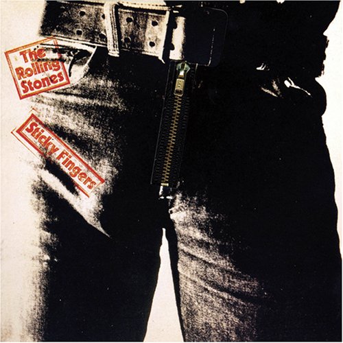
Next step was to now produce our ancillary tasks, we started with our digi back, album cover, back cover and inside pages. We initially began by looking at these albums in class;


We specifically looked out how the Rolling Stones Sticky Fingers album was very significant as a promotional pac. Specifically as this album signified a new cutting edge, 'sex, drugs and rock n roll' look to their band and music. Points of interest were particularly the album art, which was by Andy Warhol, and how his famous pop art style is clearly shown in the album with high contrast - done specifically to emphaise the 'buldge' of where the models penis should be. Heightening the products sex appeal. Also when looking at the back image of the album, thoughts of fluidity between imagery of the front and back sprung to mind. Especially how i may want to incorporate this into our own digi pac.


Starting point

I began our research of  digi pacs, by looking through albums i had at home and what elements they were made up of. Here is some images of us looking through the albums digi pac, to establish what was needed in our very own digi pac:


Also by looking at album covers of similar artists for example; all time low and boys like girls.

Conclusions after looking at digi pacs:
- Whether we should have a photographic or cartoon like image
- Whether we should use take inspiration of images from the video to provide links between both
- We should have the lyrics of the song on the inside  pages
- Also we should include exclusive imagery of the band on the inside pages.


Monday, 7 February 2011

Final Editing Touches

In the last days coming up to our deadline we made our  finishing touches, working on the improvements we had been given in our feedback review.


Above are print screens of the editing of the new lip syncing footage, making sure the visual timeline matches the audio timeline.


To finish off our video we combined all the previous narratives into one singular one. This we felt would be a really successful effect in conveying the message of the  video, bringing together all the unfortunate events, the judgement and the feelings attached to them situations - emphaised by the use of signs and text.


We also had the white room seen working alongside at the end of our video, by having the girl finally pull the scarf of her face, to show how symbolically she is breaking free from the judgement and isolation in soictey. I did this by editing the clips in short snippets inbetween the other narrative.